Showing posts with label Pretty Jewish. Show all posts

Tuesday, December 3, 2013

Paper Camellia DT: December Kit Love

Hi friends!

I am so lucky to be one of the Design Team members over at Paper Camellia Kits, especially when I get a chance to play with beautifully curated supplies like those in December's kit.  Over the next week I want to share a few things I've made.


Happy Hanukkah!  This is a sweet photo of Orli and her little menorah that I wanted to keep.

I often find December a tricky month -- it's hard when everything is Christmassy and you're a blue and silver kinda girl.  But this kit was neutral enough to be very usable for me -- and I appreciate that!  Love those Thickers that spell out Miracle -- a fun focal point and it works really well!

I textured the edges of my paper with my We R Memory Keepers Heart Attack tool (which I got on clearance at Target -- holla!) and inked them with a Prima inker.  A few enamel dots, a button, a little mist -- and don't forget those freaking awesome gold rub ons -- and yeah, I liked it.  I'm into the paper layers on this layout.  Everything looks so nice together right out of the box it was easy to put together.

Up top is more layering, mist, and a really fun star paper clip from the Alison Kreft Christmas Collection from Webster's Pages.  I love me a good paper clip.  :)

I hope you're all enjoying your December so far.  I'm working on my JYC/December Daily and will have those going up soon -- and of course, more pages from this beautiful kit will go up soon, too!


Wednesday, August 14, 2013

Orli Devorah

Well, my computer is still in the shop, but I have found that I uploaded a few pages that I totally forgot about!  I tend to do two types of pages: artsy-fartsy make it artistic pages and functional pages.  Functional pages are still pretty, but really quite sparse comparatively.  Lots of photos, less "visual emotion".  I just made that term up.  "Visual Emotion" -- I kinda like that.  So today I have a functional page to share that I made using mostly Simple Stories Vintage Bliss (which I LOVE btw).

This is from Orli's naming ceremony.  A naming ceremony is sorta (very sorta) like a Christening or baptism, but Jewish.  Basically, everyone gets together and welcomes our lovely little girl to the Jewish people.  It was amazingly touching.

No photos during the ceremony, though, so here we are outside of the Synagogue afterwards (but before Shabbat, of course!)

I made the tallit that we wrapped her in during the ceremony, and these are some fabric scraps left over from the trim of the attarah that I wanted to save because they were pretty and because I'm a pretty sentimental mommy.

(Man, I love that notebook edge punch.  I get so much use out of that thing it's crazy.)

But yes, this is a very simple page that is more about showing photos than creating an artistic moodscape. (Hey, there is another word I just made up that I think I like.  I'm on a roll!)  I think it's good to have both sort of pages.

I hope my computer is repaired soon, I have so many more recent layouts to share!  

Friday, July 12, 2013

Shabbat Shalom: Friday Favorites and Free Printable

This week's printable PL card <3
Shabbat Shalom, friends!  Another week is behind us and now it's time to sit back and enjoy friends and family.  I'm going to spend a lot of this weekend getting ready for our departure next weekend for family vacation to the beach (and I mean A LOT of family -- about 60 close and distant). This year we have Orli to pack for, so I'll be doing a lot of list making and double checking and running out for last minute stuff.  I also need to make and freeze a few more batches of baby food to pack.  So, needless to say, I'll keep busy.  Of course, that's how I like to be.

But right now I'm getting ready to pull out the shabbat candles, set the table, and take a deep, quieting breath as I really take a moment to appreciate all the good, all the beauty, and all the wonder in my life.  All our lives are so filled with blessings; I encourage you to take a few minutes this weekend and tell those you love how very important they are to you.  I'll be back after Shabbat.  Enjoy your printable and have a wonderful Saturday.

Thursday, June 21, 2012

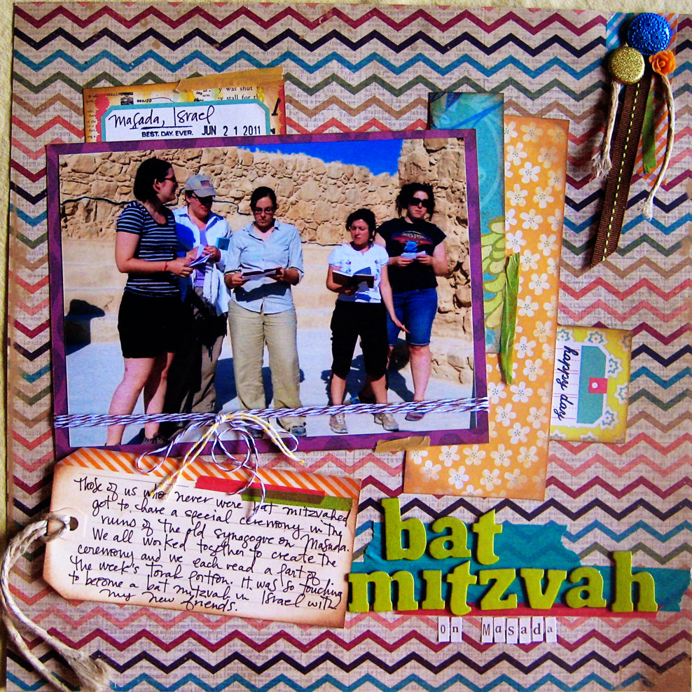
Happy Bat Mitzvah Anniversary!

Loving that Simple Stories chevron paper so so so much.
Today's post is brought to you in honor of my Bat Mitzvah, which happened exactly one year ago in Israel.  I made this layout about a month ago, but I've been holding off on sharing it until today.

  What you cannot tell from this picture, and which will one day be a layout of its own, is that I was so sick from food poisoning (turns out my wimpy American constitution cannot handle home style Bedouin cooking) that I could hardly stand up and that I was pretty much on the verge of falling over the entire ceremony.  But not this page; this page is not about the misery -- this one is about the joy.  I think the misery is just as important, and probably a lot funnier now that its over and is on my to-do list.  I'm not sure what visual I would use, because I did not think to take a photo as I spent the night on the floor of the group bathroom on the Bedouin campground.

 I was not a scrapbooker then, obviously.

Also, can I say how glad I am I finally broke down and bought distress ink in Vintage Photo and that silly little tool that has foam on the bottom for aging up my paper.  When I got it part of me was all like, "Laurie, you do not like faux-vintage stuff*, are you really going to use this?" and then I went on my internal tyrade about letting things be what they are, which is not-yet-vintage, and I probably stood in the store aisle for 20 minutes staring blankely at the wall as this whole internal monologue was going on.  But I did it, and I find it to be a great tool for roughing things up just enough to look a little dirty but not "old".  The inked edges really work on this desert layout.  So thanks, Tim Holtz, I guess.

* I mean, I like it if you do faux-vintage, but when I try something like that it just feels like a huge lie.  My pages are not vintage.  My pages were made in 2012.  My pages are like a fine wine, they have to age to a perfect vintage; they don't come that way pre-made.  Vintage on other people's pages is great and I love it, but it just isn't true to the style of that weirdo known as laurie danielle.

Friday, May 25, 2012

Being Different (Than Myself)

Gummy candy in open bins?  YES PLEASE!
Didn't I just post on Halva?  I guess I've been inspired by food a lot lately.  That is because, um, of lady hormones, I think.  We'll be back to posts that don't feature food next week.  This week, lets chow down on some scrapbooking that was actually pretty hard for me because it deviated out of my normal colorways that I enjoy and feel comfortable in.  I took these pretty serious colors but wanted to make them true to my style (which I would describe as Rainbow Bright meets Clarissa Darling of Clarissa Explains it All and they have a disco party and you're invited!).  So how do I take my natural desire for neon and wild patterns and hand drawing and tone it down without completely losing interest?  I made myself a little checklist:


  1. Pick a tamer version of a color you absolutely love (I picked this moss green variant of lime green)
  2. Keep some bold pattern, just use it judiciously.  
  3. Use the things you love, just make choices that fit within the color scheme.  (Thank you Tim Holtz washi tape!  And cute little "Sweet" doo-dad.  And not-quite matching but whatever, close enough glitter butterfly!) 
  4. Keep the calm feeling with ample amounts of negative space
  5. Add a little bit more interest with a graphic edge punch instead of adding more color
I think it worked out.  It was a struggle at times, but its fun to flip through my book and see a page that both doesn't look like my other pages, but still looks like I made it.  Don't you hate it when you're totally inspired by someones awesome page but then when you use their style it just doesn't feel like you anymore?   I feel like that all the time!  I think I struck a good balance this time, and doing something different makes me feel like I'm capable of designing on a larger scope than just what comes naturally to me.

How do you get out of your comfort zone?  Do you embrace the foreignness of creating something that doesn't look like you or do you add a little bit of yourself and your style into all of your layouts?  I would love to know!

Wednesday, May 23, 2012

Can I have-a Halva?

Its a dessert, not cheese. Also, did you notice my cute pink visual triangle - ink, gem, and tape?
Do you know what halva is?  If you do, you know why I had to make a scrapbook page about it.  Such a delicious dessert made with Sesame and other yummy things -- Oh, it is so so so so so so sososososososGOOD.  (Not an exaggeration).  I tend to have a hard time using paper with drawings and stuff already on it, but I decided that I would fight through the hardness with this awesome Amy Tangerine paper.  It was an interesting challenge because the layout of the paper really dictated where the photos had to go (unless I wanted to cover up the fun drawing bits and who whats to do that?) so it was a challenge of working within the bounds of placement. 

The awesome part was getting the look of the splattered ink without having to do any splattering myself.  I have some perfect pearls mist that I'm trying to get into (and failing) but haven't got any super inky mists yet.  Not that I don't want to, but its just sorta low on my priority list right now.  I tend to like super busy papers that just don't need ink sprays.  That and inks are a little hard to find here in small town South Carolina -- and I haven't gotten an order that is above the free shipping threshold for an online shop yet.  I am eying those sequined arrows and hearts by Heidi Swapp -- maybe I'll order in June.  My budget for this month is spent on Ikea and organization.  (Which, update, I AM LOVING) -- the extra workspace is HUGE.  Life is so much easier with the added table space.  Love it love it love it). 

Hope all is well for you out there in the internets!  While I'm deciding about inks and sequin embellishments -- is there anything else you out there think I would love?  Link me up since shopping is in my future!

Friday, May 11, 2012

BPC: Design Challenge #6

Let's not tell my mother in law I posted that photo of her on the internet, shall we?
Still loving Design Challenges over at Big Picture Classes.  My craft-space is all organized and ready to go (I'll post details soon), so I worked on this today.  This started as a two page layout, but it was looking SO. BAD. that now it is a one page that actually looks decent.  I'm going to play around with the base of the other page and see what I can do to salvage it. 

As you can see from the picture, I am hereby claiming the correct way to spell that 8-day holiday with the candles is H-A-N-U-K-K-A-H.  I'm not really one for spelling it with a "C", but I guess my only real hard and fast rule is that any spelling of Hanukkah must have 8 letters.  Why?  Because 8 is important in Hanukkah and it is the only way I can tell if I have actually spelled it (any version) correctly.  It is true -- I am not such a good speller.  (Want proof?  On the post a couple down I have, in my page's journaling, spelled "pose" (like a group of people) as "posee" which I'm pretty sure isn't even a word. I should probably fix that.) 

Don't judge!

Okay -- you can judge a little.